Image source: Frank Hartman)
When I started writing papers at university, I fetishized the visual impression of the page. This was in the 1990s, relatively early days of word processors (I was using Word Perfect), and I spent a significant amount of time worrying about font, spacing, margins, and layout. I liked pages that included a paragraph break or two and, if possible, a block quotation. I sought to have one every other page or so, simply for the look of “scholarly” prose. I also liked footnotes, and the air of erudition they immediately suggested. Even as a PhD student, I recall writing entire papers simply to earn the right to use a clever footnote I had thought of. (These papers never amounted to much more than stylistic experiments, of course.) I don’t recommend this fetish to students starting out today, but I’m sure it’s still common, and it can be a legitimate part of what George Orwell called the “aesthetic enthusiasm” of writers. If it gives you pleasure (real pleasure), by all means, enjoy the layout of the page.
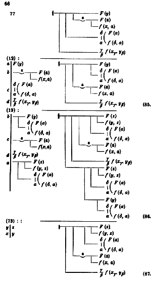
In 1879, Gottlob Frege published a peculiar book called Begriffsschrift. The title is translated variously; I settled on Conceptual Notation long ago. His aim was to present the content of our thinking in a more “perspicuous” way than words normally allow. To this end, he proposed to use “the two-dimensional extension of the writing surface” to foreground the conceptual relationship between propositions, their logical interdependence. I’ve provided a sample at the top of the post so you can see what it looks like; the idea is that truth flows through this system, somewhat like a circuit. Once you have understood his notation, you can analyze your thinking in terms of the consequences of the truth or falsity of individual propositions on other propositions. “A good notation,” said Bertrand Russell in his introduction to Wittgenstein’s Tractatus, “[is] almost like a live teacher … and a perfect notation would be a substitute for thought” (p. xviii). One can decide that it is hyperbole, or that nothing is ever perfect, but Russell’s remark definitely captures the spirit of Frege’s project. If we could write our concepts down in a perfectly “surveyable” manner, he thought, the surface of the page would do the thinking for us, like a computer circuit calculates a sum for us inside our calculators.
Orwell was right to identify the page itself as an object of desire for writers. “[They] may feel strongly about typography, width of margins, etc.,” he said. And he was right to describe this feeling as “aesthetic,” meaning roughly what art critics mean by that term. I’ve always felt that that beauty is an experience that improves experience. I tell myself that that this is a “pragmatic” approach to art; the purpose of visual art is to make us see better, of music, to make us hear better, of poetry, to make us feel better. A beautiful page is not only easier to read, reading it makes us read better, makes us better able to discern the texture and cadence of the words we use. A messy, ugly page (like, in my opinion, those of many textbooks) is destructive to our sense of text, just as bad architecture and industrial noise disorients the senses and wears us down. If good notation is like a live teacher, a beautiful page is like a good friend. We enjoy the company independent of what is being said. It’s like someone speaking in a pleasant, familiar tone of voice.
As far as I’m aware, Frege didn’t speak directly about the “beauty” of his notation. But he must have felt some analogue of Orwell’s “enthusiasm” for his lines and functions. Many logicians and mathematicians find their formulas and equations beautiful, which partly explains their choice of vocation, of course. Just as a good poem might help you feel better — not happier, mind you, but more precisely happy or sad — a good conceptual note will help you think more clearly about something — clarity feels good to a logician. And if it doesn’t actually manage to replace your thinking, learning a system of notation will help you organize your thinking in general. It will improve the rigor of your “scientific experience”, allowing you to pass more easily from observations to implications, from premises to conclusions. If that doesn’t give you pleasure, research may not be the right career for you.
But as I hinted in my last post, this aesthetic project, whether philosophical or poetic, may be taking a bit of license with space and time. In prose, we have only one dimension — the order of words passing forward in time. Using this highly restricted medium (and Frege, remember, said that his notation was intended to do something that was not possible with words) we can conjure up the entire four-dimensional universe of ordinary experience, not to mention the higher dimensions of the quantum multiverse. Prose is capable of representing (in its way) virtually anything. When poets space out the words on the page, or use enjambment, or even resort to calligrams, they are, like Frege, exploiting “the two-dimensional extension of the writing surface.” They are using language more freely than is allowed in prose, which moves forward only along a single line. In a sense that I will return to in another post, they are cheating. They are using tricks and devices that go beyond the resources of scholarly prose. The results are often beautiful, and even at times useful, but they are not prosaic. I will leave for later the question of whether these aesthetic concerns are ancillary to our research, or merely incidental, but they are not, I want to insist, the substance of academic writing.