I’ve now written about the ideal paper, the ideal paragraph, the ideal sentence, the perfect inflammatory word, and the importance of spelling. It’s only fitting that I conclude this series with some reflections on font choice and handwriting. The latter is, of course, fast becoming a lost art or, at least, a niche craft, while the former is an object of both confusion and indifference. As we pass from the age of mechanical reproduction to the age of digital automation, I want to argue, we must retain our sense of the fundamental humanity of the written word, the phenomenology of literature, the aesthetics of writing, or what Roland Barthes called simply “the pleasure of the text”. We have to care what it it feels like to read our work.
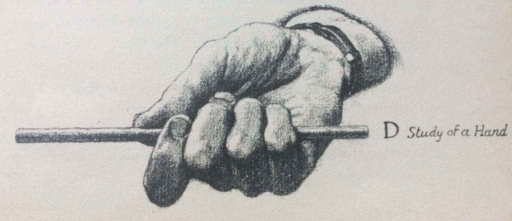
In my writing workshops, I get participants to write a paragraph that they then have one of the other participants read out loud to them. Some of them work on paper, which provides a particular challenge. Some portion of the half hour that is devoted to actual writing in the workshop must produce a clearly legible draft. This normally means they have to devote two or three minutes at the end to actually rewriting the 100-200 words they have usually composed. Otherwise the difficulty that the reader faces will not indicate issues of composition but defects of calligraphy. If you do want to work mainly by hand, then you should certainly work on your handwriting. There may be all kinds of good reasons to do this.
Many people swear that they write (and even think) better with a pen in their hand than sitting in front of screen. Some people swear that they can only write well in front of a noisy typewriter punching the letters firmly onto a white sheet of paper. Much of this is no doubt a matter of habit. Already in high school, I was writing most of my papers on a word processor, so I’ve never felt any strong relationship between my handwriting and my stream of consciousness. I learned to touch type at the same age, so I really do feel that the words appearing on the screen are a natural extension of my mind. This is clearly a personal preference, however, and everyone should find a way to work that gives them pleasure. My point is just that, whatever means of writing you choose, resolve to do it well. Practice it. Become “good at” forming the letters and words in your chosen manner. You will enjoy it more.
But once you have written a text in a way that gives you pleasure you must also make a deliberate effort, a conscious set of decisions, to make your text pleasing to your reader’s eye. Many years ago, I found Josef Albers’ wonderful textbook Interaction of Color in a used bookstore and it has profoundly affected the way I teach writing, i.e., the interaction of words. At one point, he makes the connection explicitly: “The fashionable preference for sans-serif fonts in text shows neither historical nor practical competence,” he tells us, reminding us that sans-serif fonts (like Arial) are meant for captions not prose, while serif fonts (like Times New Roman), are based on the idea that “the more the letters are differentiated from each other, the easier the reading.” I always tell people to present their work for feedback in 12-point, Times New Roman, double-spaced, with no right justification (i.e., with a jagged right margin). It doesn’t look like a published page; it looks like a draft. It is optimal for reading and giving feedback.
Writing this post, I’m reminded of my poor habits. I have terrible handwriting, and I’ve been thinking about changing the font for the posts on this blog for years. Let me know what you think of this blog’s look in the comments, please. I’ve basically left it all up to WordPress until now, but I should take my own advice and take control of my aesthetics. Typo-graphy is an interest in the (blow by blow) impression of that the shapes of letters make on your reader; calli-graphy is a cultivation of the beauty of letters on the page. These issues are neither trivial or vain. Take some pleasure in dealing with them effectively.